Colour schemes
ShopWired's colour schemes feature allows you to manage the colour settings across your entire website, for individual pages or specific elements within a page:
- When you install your theme, predefined colour schemes are created and assigned to your pages and page elements
- Your theme also has a default (root) colour scheme which is used as the default for all pages and page elements
- You can change colours used within the default colour scheme, a specific scheme or create a new scheme to customise colours
- When changing the colours used by an existing scheme, those changes are applied anywhere the colour scheme is used
- Each colour scheme has the same number of colour settings and the same labels for each setting
- Your theme determines which colours are used for different elements where the colour scheme is used
- You can create new colour schemes
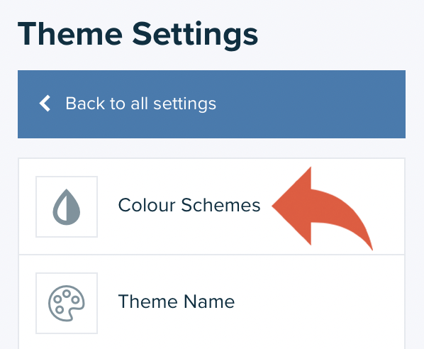
Managing colour schemes
Managing colour schemes
Your theme's colour schemes are managed within the theme settings in the theme editor. To access the schemes select theme settings > colour schemes from the left-hand menu of the theme editor:
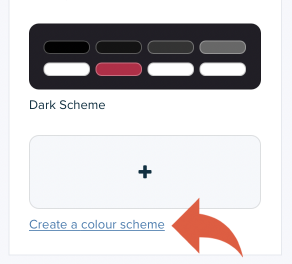
Existing colour schemes are displayed in order, and a visual indication of some of the colours within the scheme is displayed.
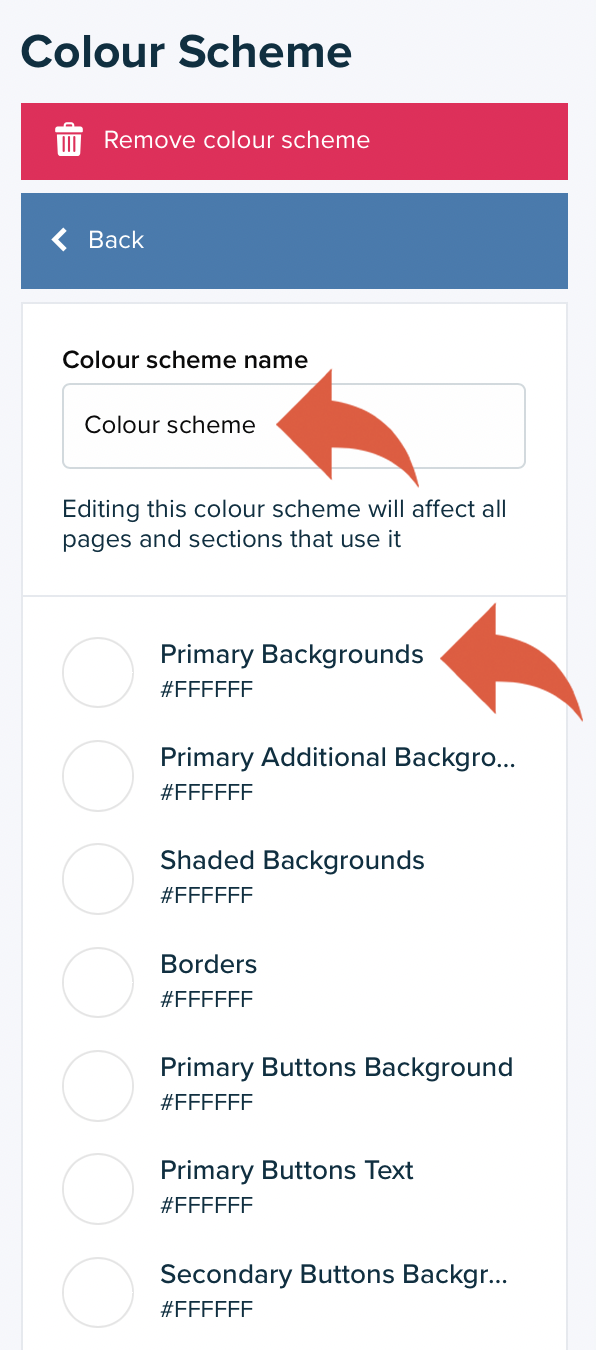
To customise the colours within a scheme, click on the scheme:
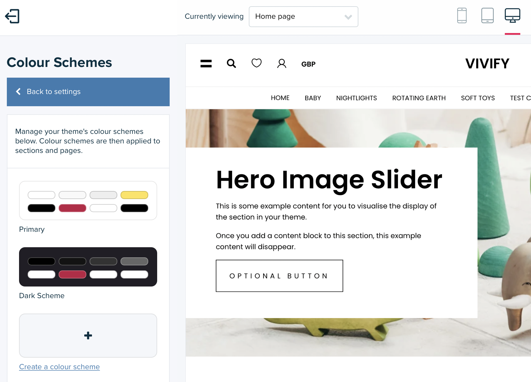
Each setting within the colour scheme is listed along with the name of the colour setting. For an explanation of the setting names, you can refer to the colour scheme definitions.
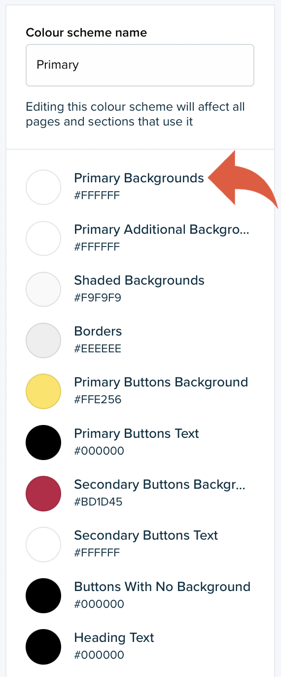
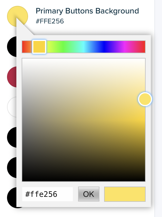
To change a colour, select the circle beside the setting name that displays the current colour for the setting. Select the new colour for the scheme from the colour wheel or enter a hexadecimal reference into the field provided. Select OK when you are done, and the live preview will update.
Creating a new colour scheme
Creating a new colour scheme
To create a new colour scheme select create a colour scheme at the bottom of the existing schemes list:
Enter a Colour scheme name (for internal reference only) and customise the colour options. You should refer to the colour scheme definitions if you are unsure what elements of your website a particular setting will change.
Your new colour scheme will then be ready for use.
Your theme can have a maximum of 50 colour schemes.
Your theme's root colour scheme
Your theme's root colour scheme
Your theme's root colour scheme is used for all pages and sections (including the theme's header and footer) where a colour scheme has not been specifically selected.
The root colour scheme is set within the Colour schemes section of the Theme settings. Scroll to the bottom of the section where you will see Root colour scheme and the list of colour schemes that have been created for the theme:
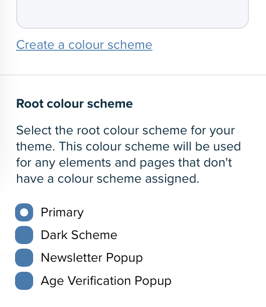
This list will include the default colour schemes the theme is created with and any new colour schemes you have created.
Assigning colour schemes
Assigning colour schemes
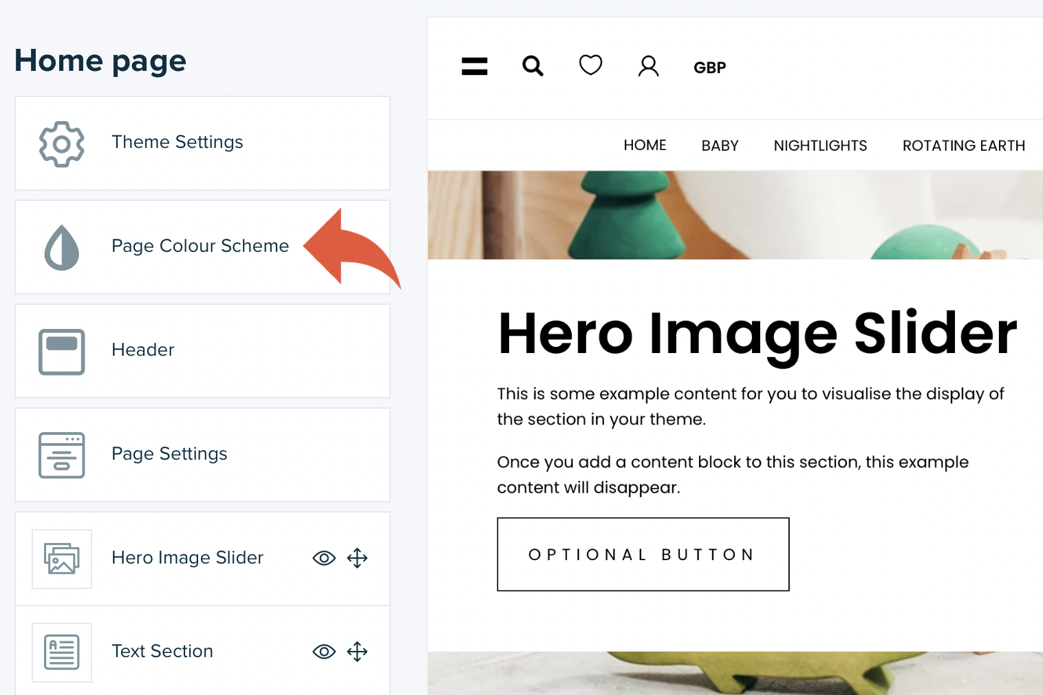
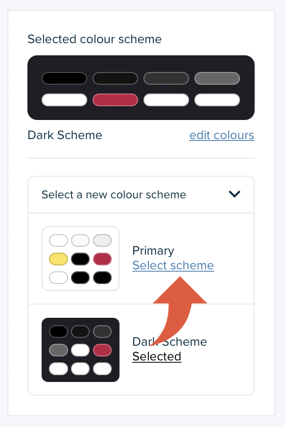
To assign a colour scheme to a page, navigate to that page in the theme editor by using the live preview and select the page colour scheme option:
Open the colour scheme options by selecting select a new colour scheme. Use the select scheme option for the colour scheme you want to assign to the page. Once selected, the live preview will refresh and you'll see the newly selected scheme applied.
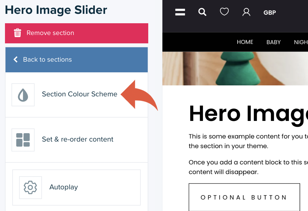
Colour schemes are applied to sections in the same way. To select a new colour scheme for a section, navigate to the page with the section and open the Settings using the section name in the left menu of the theme editor. Then select section colour scheme and choose the scheme you want to use:
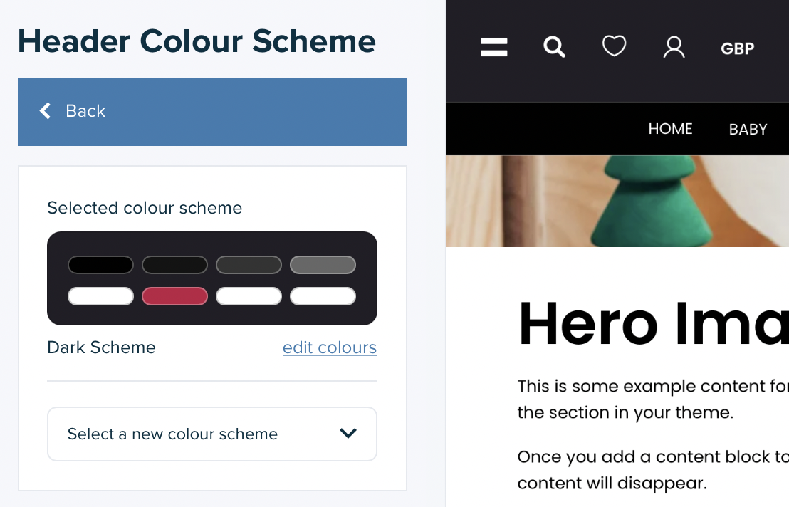
You can also select a colour scheme for your theme's header and footer from the corresponding settings sections:
Additional notes
Additional notes
The colour scheme for all pages for customer accounts (the pages available once a visitor has logged into an account) is determined by the colour scheme assigned as the root colour scheme.
Your theme may have additional colour schemes that are defined for particular elements of your theme. On Vivify, for example, two colour schemes are defined for such elements, the Newsletter popup and the Age verification popup. The colour schemes used by these elements cannot be changed and therefore to change the colours used you must change the colours within the colour schemes already assigned to those elements.
Colour scheme setting definitions Vivify 5.3.0
Colour scheme setting definitions Vivify 5.3.0
| Setting | Description |
|---|---|
| Primary Backgrounds | Applied to the primary background |
| Primary Additional Backgrounds | Applied to other background elements |
| Shaded Backgrounds | Applied to background elements that provide some contrast from the primary background |
| Borders | Applied to any borders or lines |
| Primary Buttons Background | Applied to the background of the primary button(s) |
| Primary Buttons Text | Applied to the text of the primary button(s) |
| Secondary Buttons Background | Applied to the background of the secondary button(s) |
| Secondary Buttons Text | Applied to the text of the secondary button(s) |
| Buttons With No Background | Applied to the border and text of button(s) that don't have a background |
| Heading Text | Applied to heading text |
| Primary Text & Icons | Applied to body text and icons |
| Secondary Text & Icons | Applied to other, secondary, text |
| Links & Warnings | Applied to links and warnings |
| Notice Backgrounds | Applied to the background of notices |
| Notice Text | Applied to the text of notices |